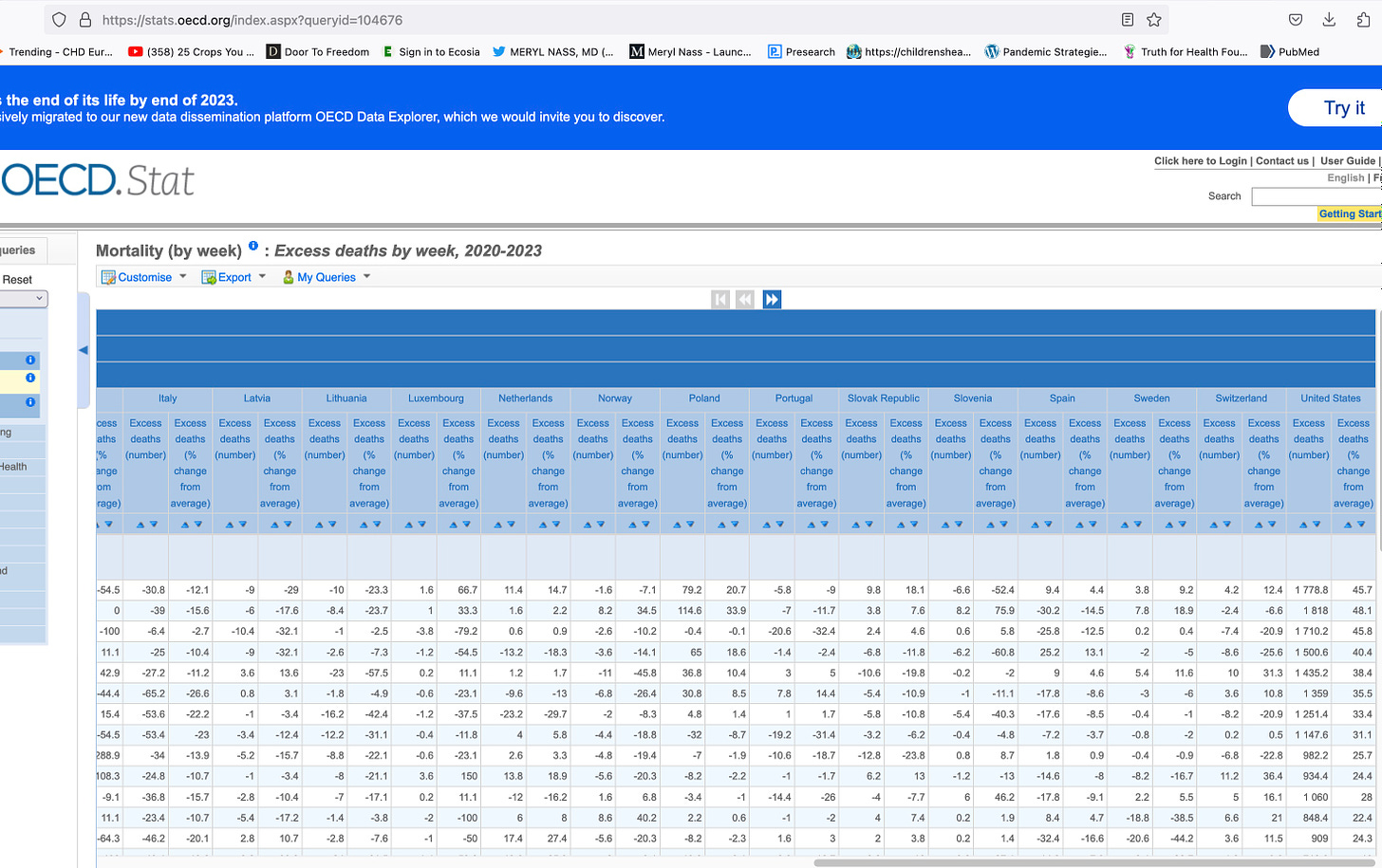
Thanks to many others for pointing me to these OECD data
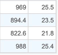
I enlarged the US numbers but grabbed a screenshot of the whole chart so you know where it comes from
https://stats.oecd.org/index.aspx?queryid=104676
You need to play with this yourself. You can look at ‘excess deaths’ by country, age group (I chose 0-44 years) and by year, and the chart gives you the excess (#more than the expected number) of deaths and percentage higher than normal, by week. You can then change the year for a comparison. I think these were the US numbers for 2022, and deaths seem to be increased by at least 25% over the baseline.


I must tell you. My first words were HOLY SHIT. Love you Dr Nass.
GOD bless you Dr. Nass - you shine both inside & out ...