


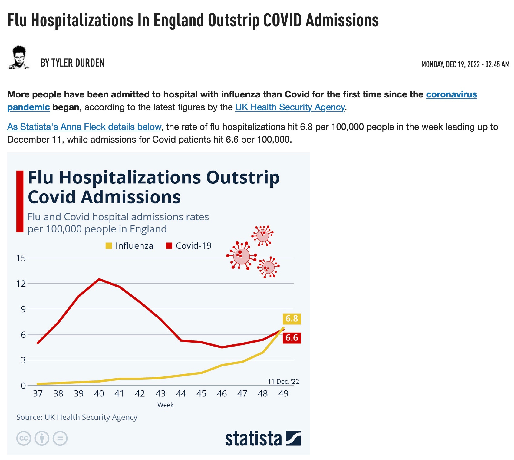
Let's look at how COVID and the Flu compare to each other right now, and compare to past years
Hint: It's a mild flu year so far, yet there are more flu than COVID hospitalizations in the UK.

https://www.zerohedge.com/covid-19/flu-hospitalizations-england-outstrip-covid-admissions
And these are official numbers . But it gets better.
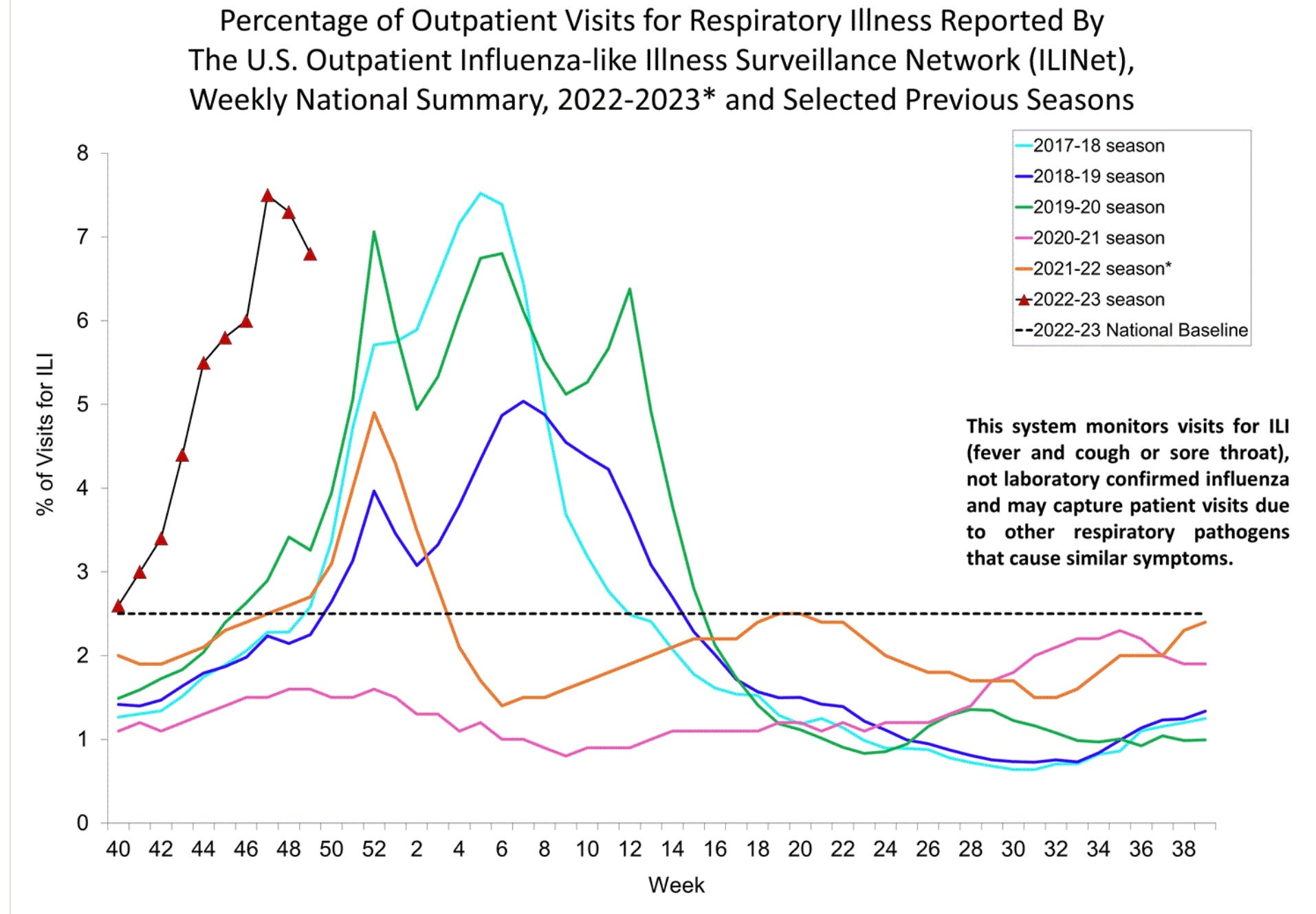
Below is a CDC chart that compares the % of doctor visits that are for respiratory infections by week. Each color represents a different year. This year is black. Infections peaked early and are already falling. Another flu may appear later in the season; this happens sometime. But you can see we are in the normal ballpark. https://www.cdc.gov/flu/weekly/index.htm
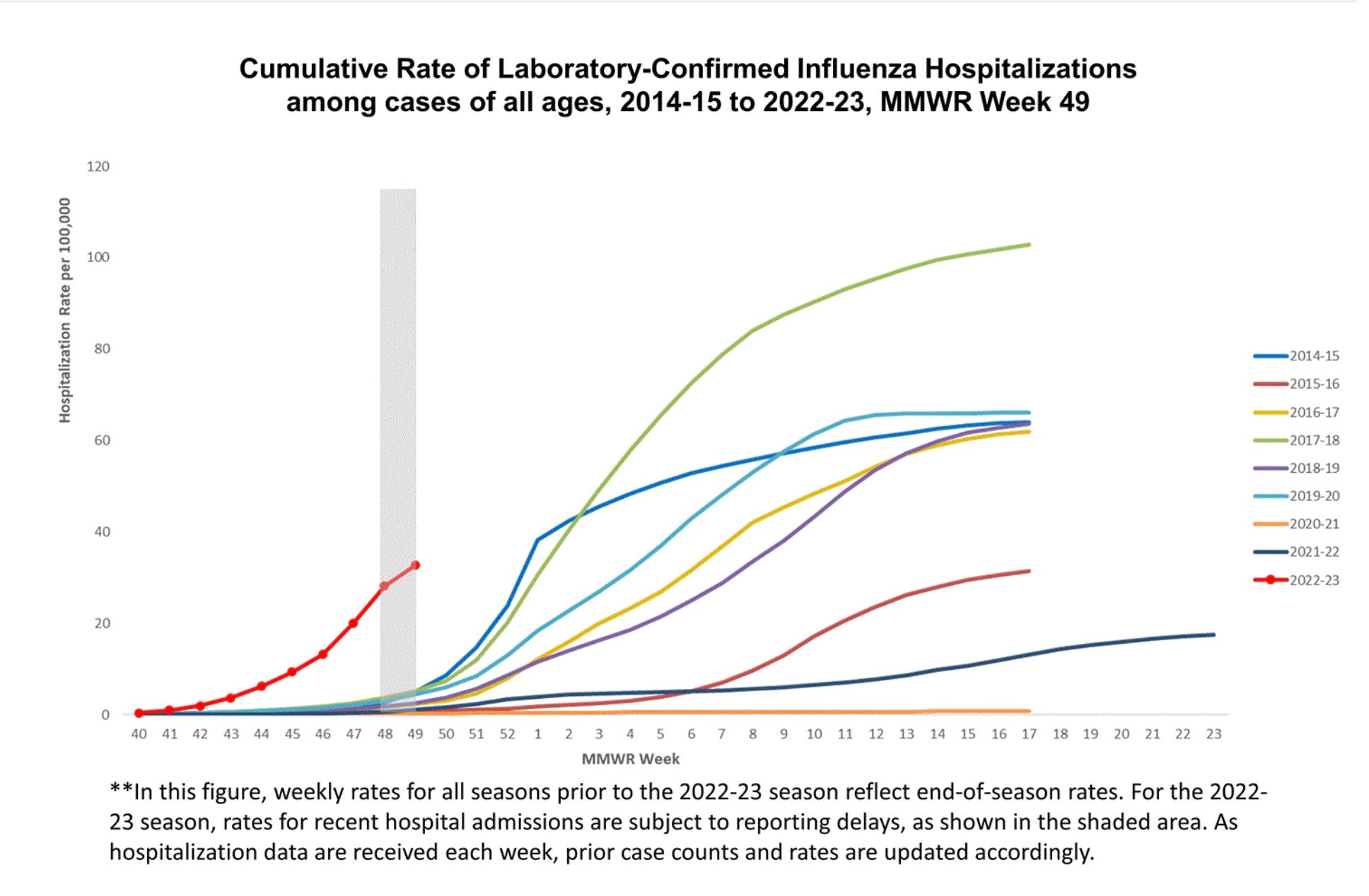
This CDC chart (same URL) shows that although this year (red) flu hospitalizations began early, they rose at a normal rate and are way below an expected peak level though cases seem to have started dropping. So much for the dread FLU-COVID scamdemic winter.
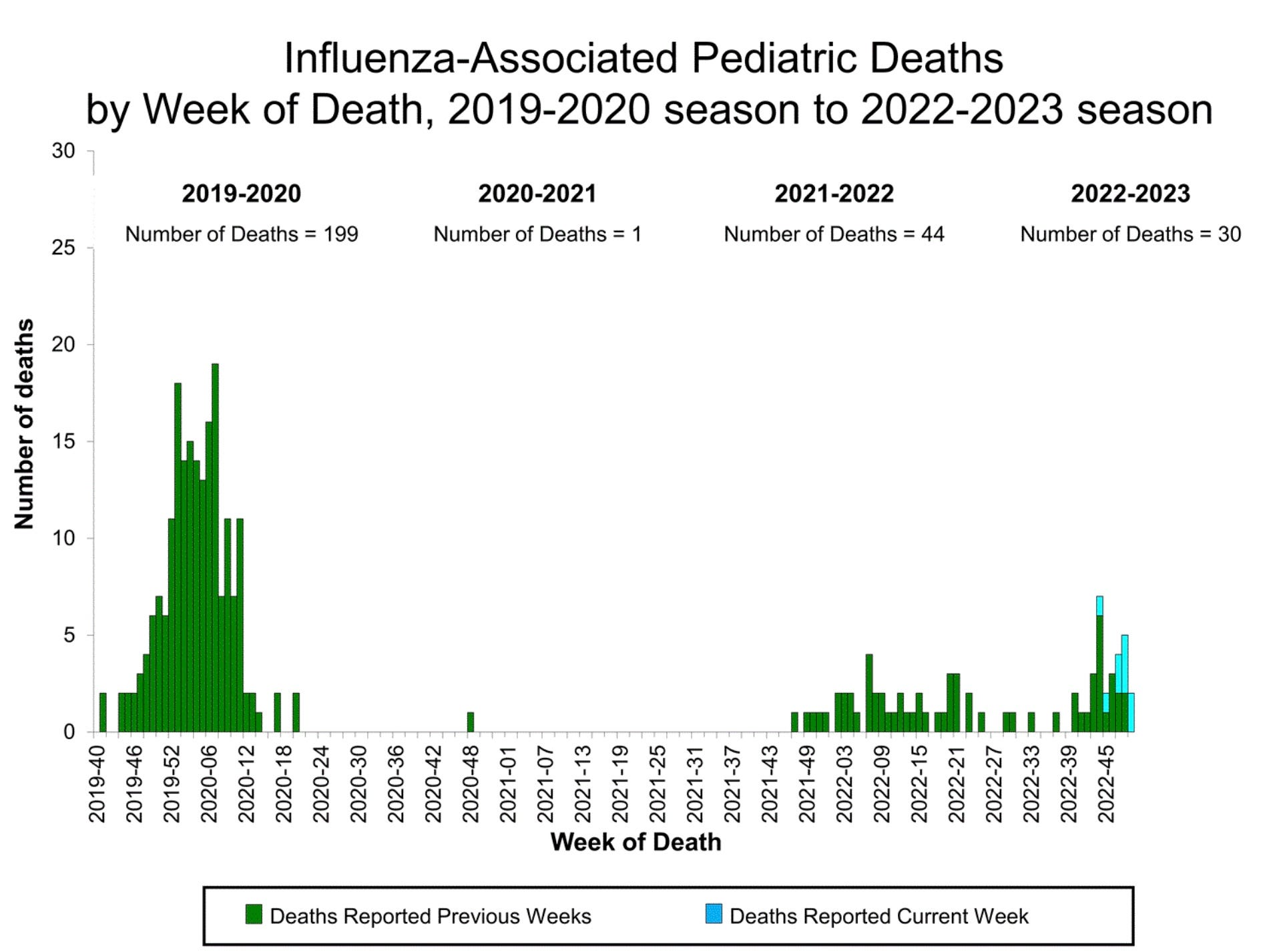
Below lists pediatric deaths, in which flu was detected, by week, for this year and the last 3 years. You can see we are not having a bad flu year. There were not a lot of hospitalizations. And yet they have begun to exceed COVID hospitalizations. Do where is the emergency?
And if we were allowed to treat COVID properly at its onset, almost no one would need to be hospitalized.
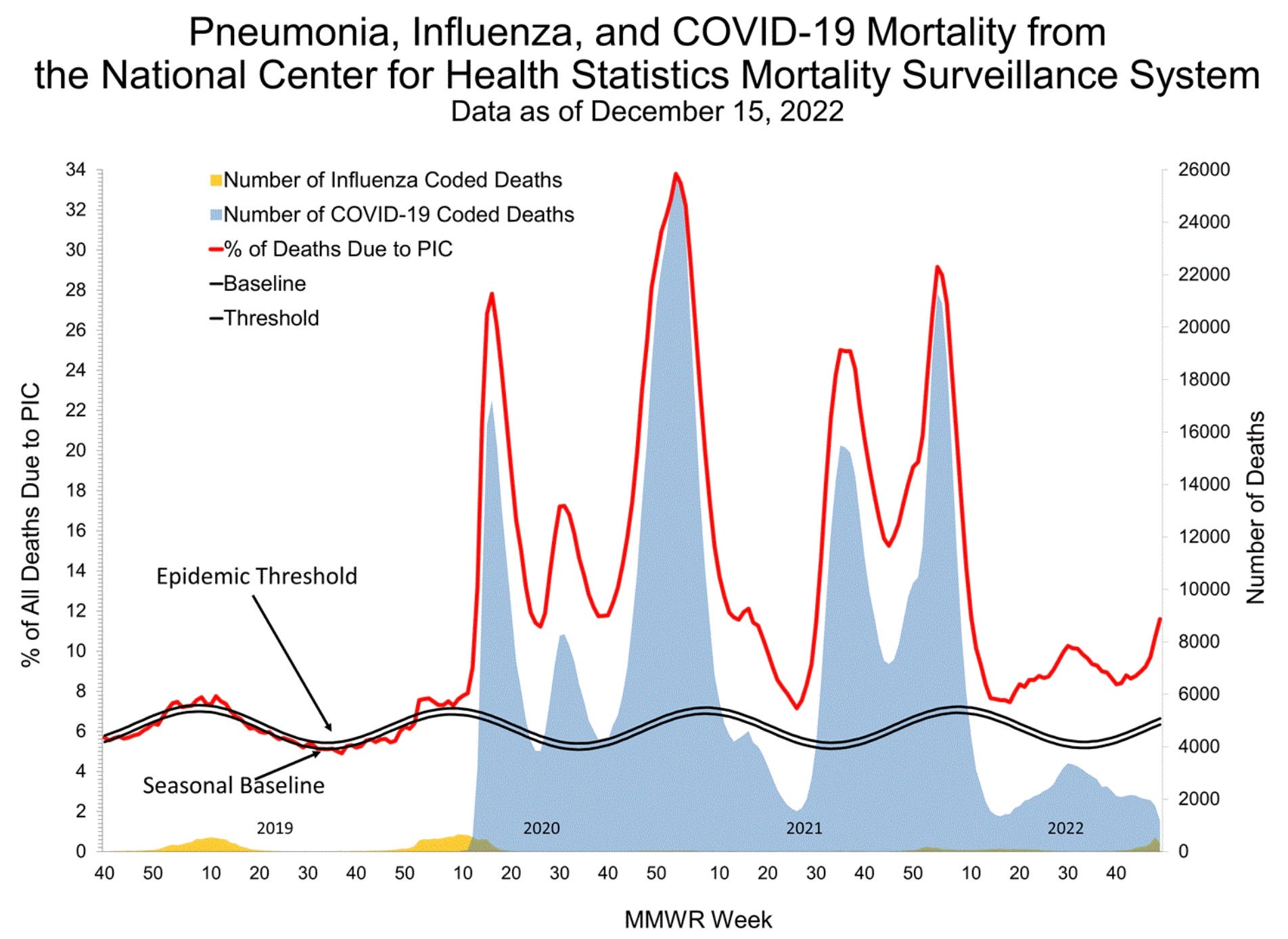
Last but not least, CDC lumps together US deaths from influenza, pneumonia and COVID (PIC) by week since 2019. Look at the deaths for each year at week 50. PIC deaths (in red) and COVID deaths (blue) are way below where they were in 2020 and 2021. Somehow PIC deaths are up while COVID and Flu deaths are not, suggesting there is an epidemic of pneumonia unrelated to them. Perhaps this is to be blamed on RSV, as 2 RSV vaccines and an RSV monoclonal antibody are waiting in the wings for an FDA approval.
Then look at the flu deaths and the COVID deaths right now. COVID and flu deaths are pretty low. Looks to me that the so-called crisis ended last April.
“Believe the official narrative, not what your eyes and brain tell you!” I am seeing warning headlines about the cluster of viruses, threats of mask mandates returning, instructions to get more shots... I am grateful for your showing the truth here.
The last graph is the most interesting. While Covid deaths are falling and flu deaths are very low, the red line, which is pneumonia + flu + Covid, continues to rise. That means a lot of people dying from pneumonia that isn’t related to Covid or flu. Why would that be? Might it be that the immune systems of the elderly are completely shattered after 4, 5 or 6 shots???